Dashboard 2.0 provides an at-a-glance view of the performance and health of your infrastructure and services. Powered by the Prometheus Query Language (PromQL), you can query metrics for most use cases to quickly identify issues. Dashboard 2.0 permits you to:
- Visualize any data collected using flexible queries.
- Customize charts for personalized data visualization.
- Leverage out-of-the-box content to get metrics from commonly used services.
- Create new dashboards and reuse existing dashboards for easy portability.
- Create data-rich charts using PromQL.
Getting started
Follow simple steps to create the visualization you want with data populated by PromQL query definitions, as shown in the following examples:
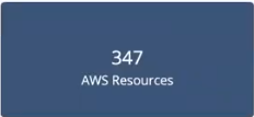
Example 1
PromQL query to return multiple time series: sum(usage_cloud_provider_aws)
Visualization:
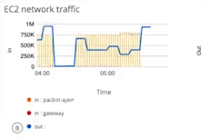
Example 2
PromQL query to graph the inbound and outbound traffic on an ec2 instance: usage_cloud_provider_aws{instance="ec2.instances"}
Visualization:
Basic create dashboard steps
Open the dashboard menu to:
- Create a dashboard using the dashboard builder tools
- Import a dashboard
- Upload a JSON file that can be used to instantiate a dashboard
To create a dashboard manually:
- Create the dashboard.
- Create a metric, text, or image tile.
- Enter a PromQL query.
- Select from Combo, Value, or List chart type.
- Customize the visualization.
- View the dashboard on the main dashboard page.
References
- OpsRamp Blog: A Dashboard Guide for IT Metrics
- OpsRamp Blog: Defining Killer SLOs with OpsRamp
- Querying Prometheus
Classic Dashboard and Dashboard 2.0 Differences
| Classic Dashboard | Dashboard 2.0 |
|---|---|
| Widgets are pre-configured. | Surfaces any user-defined metrics or object data. |
| Static widgets. | Customizable tiles powered by PromQL. |
| Limited number of out-of-the-box dashboards. | A curated set is provided for AWS, Azure, Google, Kubernetes, and public cloud. You cannot modify these dashboards but you can copy and edit them. |
| Not portable. | Import, export, and copy functions available. |
| Not customizable. | Fully customizable. |
| Simple list organization. | Collection organization for grouping similar dashboards. |
Current Dashboard 2.0 constraints
Dashboard 2.0 constraints
- Available to auto-monitoring clients, only. At the client level, the dashboard is associated with the user. Partner level can view dashboards in the context of any clients. A client cannot view a dashboard that a partner created.
- There is no public dashboard API.
- Only metric data is handled, not alerts or incidents.
- Only applies to cloud and cloud native resources.
- Dashboard names within a tenant must be unique.
- Curated dashboards can be viewed only for installed integrations.
PromQL constraints
- No range vectors.
- Unsupported functions:
- sort
- group by; an only query on individual resources
- Cannot query on resource groups, only individual resources.
- Cannot group on specific values.
- No truncation of decimal values.
Dashboard menu
| Function | Description |
|---|---|
| Create Dashboard | Manually create a dashboard using the dashboard create tool. |
| Import Dashboard | Import a JSON file previously exported using the dashboard export option. |
| Create Collection | Create a folder for grouping dashboards. |
| Search for dashboards or collections | Search for a dashboard or collection by name. |
Dashboard list
The dashboard list shows curated, pre-configured dashboards and user-created dashboards. Click on the dashboard entry to view the dashboard. Dashboards are only displayed if the associated integration is installed.
PromQL query builder
The time series and operations specified in the query power the dashboard visualization. After selecting CREATE TILE, choose the tile type you want and click Data to enter one or more PromQL query definitions.
Use the PromQL language constructs described, below, such as attributes, operators, and functions, to select and aggregate time-series data in real-time and slice time series to create the visualization you want.
Use the dashboard autocomplete feature to show all available matching metrics.
When specifying tags, enter a bracket, {, to get a list of all tags associated with the resource.
In the Legend input field, use double-brackets, {{, to list all available tags for the resource. The legend filters and only shows matching tags for the resource.
You can specify multiple queries in a query definition. Click + to add queries.
General query definition syntax
A PromQL query definition has the following general form:
function(metricName{attribute="value"})The most basic definition is to specify the tag name to select a time series. For example:
google_storage_network_sent_bytes-countThe PromQL language also supports filtering by attribute, functions, operators and regex expressions:
| PromQL Construct | Example |
|---|---|
| Filter on attribute. | google_storage_network_sent_bytes-count{region="us-east-1b"} |
| operator | google_storage_network_sent_bytes_count/(2000^2) |
| function | sum(google_storage_network_sent_bytes_count) |
| regex, using RE2 syntax | google_storage_network_sent_bytes-count{region="us-east-*"} |
Visualization
After specifying the metrics you want to populate the dashboard, choose Visualization to create the dashboard visualization.
Metric tiles
Metric tiles support PromQL-driven line and bar time-series, single-value, and list chart types of up to 30 time series.
| Chart Type | Name | Description | Example |
|---|---|---|---|
| Single-value | Value | Displays a metric value at one point in time. Queries that return multiple series must have an aggregation. For example, avg(system_cpu_usage_total) | |
| Time-series | Combo | Displays metric values over time and can support up to two queries. The metric can be represented by a line chart or a bar chart. | |
| List | List | Displays the returned series and associated metric values at a single point in time, in list form. |  |
Metric tile customization
Dashboard 2.0 provides a rich toolset for customizing visualizations:
| Field/Element | Description |
|---|---|
| Header Label | Add a title to your chart. |
| Grid Lines | Enable or disable grid lines. |
| Background | Change the background color. |
| Display | Toggle between Line and Bar charts. |
| Legend | Enable or disable a legend display. |
| Data Color Mapping | Change the color of each series. Color pallets are customizable for time series charts, only. |
| Axis | Enter and customize axes labels. |
| Thresholds | Configure the chart to change color and background color when a specified threshold or condition is reached. This applies only to single-value and list chart types. |
Text tiles
Use text tiles to provide messages and descriptions for dashboard content.
Image tiles
Images can be uploaded as tiles.
Dashboard options
| Action | Description |
|---|---|
| Set Default Dashboard | Selects a dashboard to be the first to be displayed when the main Dashboard 2.0 page is visited. |
| Copy | Copies a dashboard to the specified collection. Dashboards must have a unique name. |
| Move | Moves a dashboard to the specified collection. |
| Export | Exports the dashboard as a JSON file, which can be imported using the **Import Dashboard** menu option. |
| Rename | Renames the dashboard. |
| Delete | Deletes the dashboard. |
Filters
| Filter Type | Description |
|---|---|
| filter on time range | Select a time range to filter the start time and end time for displaying metric data. Select pre-defined time intervals or use the date time-picker. |
| filter on variables | Assign a named variable to the value of an attribute to toggle between series to display. |
Collections
Collections group dashboards, providing a way to organize dashboards. You can copy and move dashboards to a collection.